A showcase of expertise: the supplements

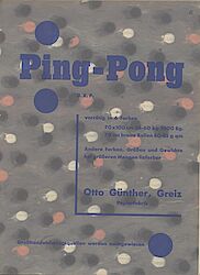
In the introduction to the trial issue, publisher Frenzel announced back in 1924 that his new magazine would »give companies, be they involved in printing or in the application of commercial graphics, the opportunity of demonstrating their services as a group.« It was a widespread practice at the time among printers, manufacturers of printing machinery, dye factories, paper mills and print finishers, to prove the capabilities of their latest achievements by producing their own work samples [fig. 01] – this was also true of graphic designers. For the companies a supplement to the magazine was quite a commitment, because they had to ensure there were sufficient numbers of the prints available; but for the publisher, too, it was also a complicated business, because they had to integrate these samples into the production process of the magazine, both logistically and technically [fig. 02].

The very first issue of Gebrauchsgraphik – focusing on advertising for heavy engineering – included ten plates, mounted on black card, with poster designs by K.H. Schaefer of Hagen, plus further supplements featuring, amongst other things, products by Osram and Siemens. In terms of print technology, the absolute highlight of the entire set of Gebrauchsgraphik was the opulent special issue entitled »Erasmusdruck« (GG 12-1924/25): Designed to showcase the capabilities of the Erasmus printing house in Berlin, this issue is notable above all for the four samples of relief printing that bring to life the packaging and cover motifs, such as the »Wächter-Mann« of the steel merchants of the same name [fig. 03].
This issue also came with lots of samples – prints enclosed as separate sheets or affixed to pages bound into the magazine [ill. 04] – plus colour illustrations of the company and red chalk drawings of production processes. As such this special issue is a showpiece of the internationally outstanding quality that characterised the German printing industry at the time [fig. 04].

There are also isolated examples of modern advertising design [fig. 05], even though publisher Frenzel was not primarily interested in the avantgarde approach of »New Typography« (see novum 09.2014). Notable exceptions are without doubt the eye-catching folded leaflet on Paul Renner’s typeface Futura (GG 03.1929) which was promoted as a »typeface for photomontage«, and the article on »handwriting – type / drawing – photo) of the advertising specialist Max Burchartz of Bochum, who here – following consistently the lower- case tradition of the Bauhaus – writes very much in line with »New Typography«. As one of the few manifestations of the avantgarde in Gebrauchsgraphik, he includes with this article an original Orion advertising print. Herbert Bayer’s 24-page advertising brochure for the major exhibition on »Deutschland« held in the exhibition halls at the Funkturm (Radio Tower) in Berlin (GG 04.1936) was intended, alongside the 1936 Olympics, to show the foreign guests just how advanced the Nazi state was; the brochure was stuck into all the copies of that issue, as a work sample, even before the exhibition had opened.

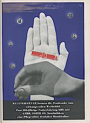
Another focus in the supplements were the attempts by laboratories, printers and lithographic establishments to draw attention to their special techniques for the production of colour photographs (see novum 07.2014) and their application in print products [ill. 07]. One such company, Meisenbach Riffarth & Co A.G., a Berlin-based colour-gravure printing specialist, presented its expertise in an eight-page portfolio featuring, for example, authentic chromatics and impressive skintone gradations.. Classic black-and-white photography was also given due attention, although perhaps in unexpected contexts: In issue no. 11 of 1935, the Graphische Werkstätten Gerhardt & Teltow, Leipzig, advertised its prowess through a photographic original print from the popular Yva studio in Berlin; the print was affixed to backing card after a colour-printed perfume label in mini format had been applied to it [fig. 06]. Even though all these supplements in those still available early issues of Gebrauchsgraphik were often separated, an important and considerable contribution of the magazine was to present these authentic advertising samples in a high-quality documentation; elsewhere, in secondary literature, very few examples have survived.

