Modernity vs. avant-garde I: Make room for the worker!

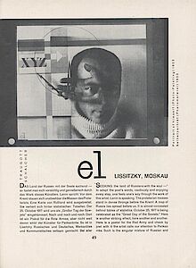
By the time the decision was taken to go bilingual in German and English, if not before, Gebrauchsgraphik was laying claim to be a leading visual trend-setter of its day. But part of its job was also to serve the interests of a global trade audience which although perhaps individually appreciative of typographic escapades such as those of Russian Constructivism, probably had very limited scope for implementing these ideas in their own day-to-day work outside the cities. The task of the publisher therefore was to find a sensible middle road between the interests of a broad target audience and the sometimes unsettling approaches an art-inspired style of advertising design, about which the early Dadaist Richard Hülsenbeck penned the following in his »Lied der Plakate« [Song of the Posters] (GG 1/1927): »The cry of posters from the concrete walls / Proclaims a fairyland that we have lost, / Wild forests rise before us tempest- tossed, / And from Skyscrapers tumble waterfalls.« The most impressive works from the Soviet Utopia were without doubt those presented in the 16-page article on the Russian Constructivist, El Lissitzky, published in 1928 in the follow-up to the International Press Exhibition in Cologne. In two-colour print – black and red, echoing the core colours of Soviet propaganda – Traugott Schalcher, for example, praises his design for Wladimir Majakowski’s »October Poem« [fig. 01], the »Abstract Cabinet« in Hannover, the photomontage frieze at the Press Exhibition, his poster »Beat the Whites with the Red Wedge« and the figurines from the »Victory over the Sun« series. Seen from today’s perspective, this is still a superb selection of images, covering all of Lissitzky’s main typographical works, and can claim to be probably the earliest contribution to his canonisation – even though the author seems not too certain about the evaluation: »How should one address such art that is as abrupt and gentle, mystical and material, appealing and confusing as the world in which we live?« (p. 58)

Lissitzky’s double-exposed self-portrait seems finally to hold particular fascination [fig. 02], as a lead-in to the article it can even be interpreted as proof that its originator is not so much Russian as more »a modern Grand European type« (p. 51).
A similar status was given to the richly illustrated article, published in 1927, on John Heartfield’s cover designs. Like Lissitzky a Communist by conviction (this speaks for the ideological independence of Gebrauchsgraphik) and as a co-founder of Dadaism an enfant terrible to the established art world, Heartfield produced deeply critical photomontages for Willi Münzenberg’s Malik publishing house and others. Heartfield’s photomontage for Malik’s yearbook »Platz dem Arbeiter« [Make room for the worker] of 1924 [ill. 02] is one of the earliest ever applications of this technique on a book cover, long before he became well known for his whole-page montages for the Arbeiter-Illustrierte-Zeitung, AIZ (workers’ pictorial newspaper). Gebrauchsgraphik reproduced classics like his book covers for Upton Sinclair’s collected works, published by Malik, and also controversial works such as his cover for »Eros – Das Buch der Leidenschaft und der Liebe«.

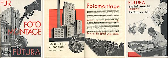
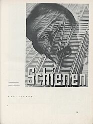
Heartfield’s masterly photomontage, an innovation typical of the avant-garde, was described in March 1929 in a highly regarded Futura advertising supplement as a »new form of expression« [fig. 03]. Robbed of its political connotation it was quickly taken up by the world of advertising where it was also termed »photocomposition«. One of its main proponents, Heinz Hajek-Halke, is covered at length in the August 1933 issue of Gebrauchsgraphik, which featured his series of ads for Eukutol and Trilysin, skin and hair tonics. A certain »mysterious quality« was ascribed to his works, a quality that »exercises a strong pull on the audience« (p. 48) [fig. 04]. And in the same issue some montages by Karl Straub, a graphic designer from Stuttgart, show how the technique has long since developed from being a tool for the avant-garde to a trademark for all modern designers [fig. 05].

